playMaker

Author Topic: The look of Playmaker FSM components changed  (Read 851 times)

Gua

  • Beta Group
  • Sr. Member
  • *
  • Posts: 309
    • Andrii Vintsevych
The look of Playmaker FSM components changed
« on: January 07, 2022, 12:45:06 AM »
Latest version of Playmaker.

I've recently upgraded my unity version from Unity 2018.4.31 to Unity 2018.4.36. And I've noticed that the look of FSM components changed. I think it is save to assume that the old look of FSM components consumed less performance when object with lots of FSM was selected. And it was easier to work with them, since they did consumed that much space in the inspector. So I want to figure out what happened and how can I restore old look of FSM component.

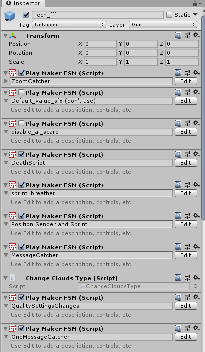
Here's how those components looked like in 2018.4.31


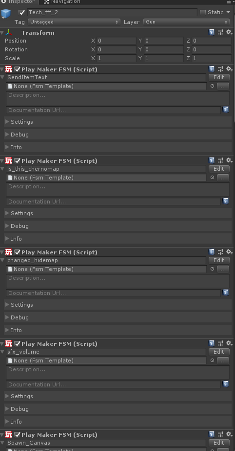
Here's how they look in 2018.4.36

Gua

  • Beta Group
  • Sr. Member
  • *
  • Posts: 309
    • Andrii Vintsevych
Re: The look of Playmaker FSM components changed
« Reply #1 on: January 07, 2022, 01:09:33 AM »
I did more experiments. And it seems that it is not related to Unity or Playmaker version. But for some reason. Same project in same version has different look for Playmaker component on different PCs.

Gua

  • Beta Group
  • Sr. Member
  • *
  • Posts: 309
    • Andrii Vintsevych
Re: The look of Playmaker FSM components changed
« Reply #2 on: January 07, 2022, 01:13:03 AM »
Okay. I've figure it out. If you click on gear icon. There's option "show full fsm inspector". I've probably accidentally clicked it.

But I've got to admit that it's weird that this affects all project on PC and that you can't find it in Playmaker preferences. Cause this is the first place I've looked, when I encountered that issue.